The US market (S&P 500), here in April 2021, is at an all-time high of 4100 and significantly above the level when the Covid-19 pandemic hit in February 2020 (3400). The European market (Euro Stoxx 50) is at a similar all-time high of 4000, but has seen only a limited increase from pre-COVID-19 levels (3800 in February 2020). But where are the markets heading?
As is often the case when trying to look into the future, there is no simple answer. My own view is basically that trying to predict where the markets will be in 6, 12 or 24 months is a waste of time. But if we can’t predict the future, we can at least try to figure out where we are today. To that end, we will look at three recognized indicators that can be used to assess the current price level of the market:
- The Buffet indicator
- Shiller CAPE ratio
- Tobin’s Q ratio
These indicators are not useful as short-term signals of where the market is heading. Periods of over or undervaluation of markets can last for many years. But the indicators can help us evaluate what we can reasonably expect in terms of returns over a long time horizon (5+ years).
1. The Buffet indicator - Willshire to US GNP
One of the best indicators to understand how expensive (or cheap) the current market is, is the so-called ‘Market cap to Gross National Product (GNP)’. Or in Danish, the market’s market capitalization compared to gross domestic product (GDP). Back in 2001, Warren Buffett stated in an interview with Fortune Magazine that“it is probably the best single measure of where valuations stand at any given moment.”
Looking at the global stock market, there’s no getting around the fact that the US remains the biggest player and often sets the tone for the rest of the world. In fact, by 2020, the US will account for approximately 54% of the total value of listed companies in the world. If you own a global index or have a portfolio that roughly matches the distribution of the world market, the price of the US market is therefore very indicative of where we stand in terms of prices. the historical levels. Also for Danish investors.
The most informative version is shown in the graph below. In the counter is the Wilshire 5000, which is an index of the 5000 largest companies in the US. In the denominator is the US Gross National Product (GNP), which is the total revenue of all US citizens (regardless of where they reside).
Current data
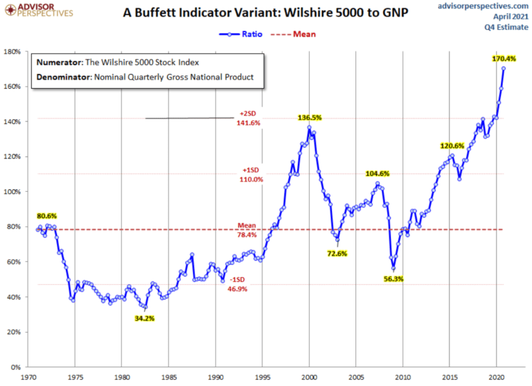
As you can see in the graph, at the end of April 2021, we are at the highest level in the last 50 years. This is a nice increase from the level just six months ago, when we were at 151%. If we reflect on it for a moment, it’s not really that surprising. The market is at an all-time high, economies around the world – and certainly in the US – have seen quite significant drops in their gross domestic products due to Covid-19.
Some may legitimately argue “well, the market generally rises 6-8% per year, so the graph can’t possibly be accurate”. That’s a fair point, but even when correcting for market trends, we’re currently 84% above the 50-year average. Today’s price levels are only surpassed by the IT bubble in 1999, when we reached 96% above average
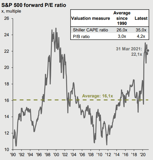
2. Shiller CAPE Ratio
Professor Robert Shiller of Yale University invented the Shiller PE ratio to measure market valuation. The standard Price/Earnings (P/E) ratio measures price to earnings. Shiller PE eliminates the fluctuations in the ratio caused by companies’ operating margins over the course of a business cycle. Hence the name “Cyclical Adjusted Price Earnings” ratio, or CAPE.
Current data
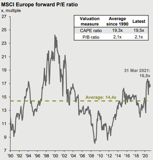
Looking at the CAPE ratio for the European market (MSCI Europe) over the past 30 years, the average has been 19.3 and is slightly higher at 19.5. A nice increase compared to the level of the last several years. The European market is now on par with the historical average and in this context ‘fairly’ priced.
The US market (S&P 500) has been elevated in recent years and is today significantly higher than historical levels with a CAPE of 35.0 versus an average of 26.0.
3. Tobin's Q Ratio
Developed by Nobel Laureate James Tobin, Tobin’s Q is calculated by taking a company’s market price and dividing it by the cost of replacing the company’s assets. Or to put it another way: If the ration is 1, it means that the cost of building a new company matches the market price. If the Q ratio is above 1, the company is overvalued, below 1 it is undervalued. The same can be done in entire markets, as illustrated below.
Current data
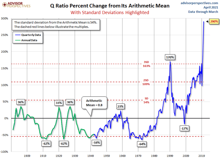
The graph above shows the development of Tobin’s Q for the US stock market (specifically the Vanguard total stock market / VTI). As you can see, we are currently at the highest level in the last 100 years. Even if we only look at the last 25 years, we are at a very high level.
What can we expect going forward?
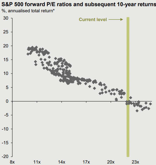
If we simulate what returns we can expect based on the current market situation and the companies’ expected earnings, the future does not look particularly bright. If we look at the US market, historical figures show that the next 10 years’ returns can be expected to be in the region of 0%. Plus/minus a few percent to cover uncertainty. Thus, there has been no improvement since we looked at the figures in Q3 2020 – on the contrary, the market has continued to move to higher levels.
A 0% expected return is not exactly impressive when the US market has on average returned around 8% per year.
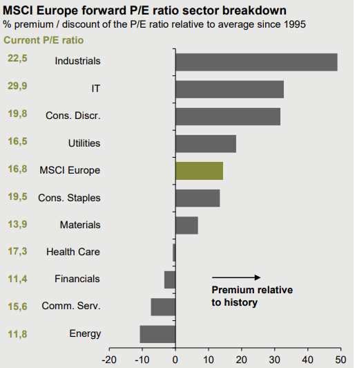
The European and emerging markets, on the other hand, are relatively fairly priced in a historical context. And if we look at the P/E ratios of the individual sectors in the European market, they show quite a wide spread. At the most expensive end of the scale are industrial and IT companies. At the other (cheaper) end, we find the energy sector, such as the big oil and gas companies, communications and finance. These sectors can be an interesting place to look for bargains.
But at the same time, it doesn’t necessarily mean that we should rush out and buy European energy companies, for example. But it does show that there are countries and sectors with relatively fair/low prices, despite the general market. We’re far from the only ones looking at these numbers and that there is often a legitimate reason why certain sectors or individual companies are ‘cheap’ in a historical context. For example, Morgan Stanley analyst Martijn Rats, in a recent article in Barron’s, states that “The major European energy companies trade for a “historically wide” discount to their U.S. peers as investors take a cautious view of the Europeans’ decarbonization strategies. The European majors, BP, Royal Dutch Shell, and Total, trade for half the cash-flow multiples and close to double the free-cash flow yields of the U.S. majors.”
What does all this tell us about the current market?
The above three indicators all point to a market that is at the very expensive end of the scale from a historical perspective. No matter how we measure it. On the other hand, if we take into account that
- international interest rates are extremely low (negative in many places),
- many governments have massively stimulated economies,
- private households have continuously increased their savings and
- many individuals have postponed purchases of various products and services (think hairdressing and travel)
it’s not surprising that despite high prices, stocks still appeal to us investors. Therefore, I don’ t think we should sell and go cash. There’s really no other sensible place to put your long-term savings, and this will cause a whole host of challenges, from taxes to the need to predict where the general market is heading.
That said, being a bit defensive seems sensible in today’s market. My specific suggestion for a long-term investor (10+ years) is to have 10% or 20% of our total savings/portfolio in cash or short-term bonds. This can be done, for example, by leaving your current savings in cash/short-term bonds or by saving dividends. When the markets take one of their inevitable downward turns, you have the means to invest at more favorable prices.
If you have a larger amount of money you want to invest, consider
- buying into the market over a longer period of time, e.g. 20% of your savings every quarter and
- to have a greater emphasis on the European or emerging markets. Both are reasonably priced in historical perspective.